Dark Mode Design: Enhancing User Experience in Mobile Apps

Dark mode has emerged as a key component of mobile app design in recent years. In addition to being aesthetically pleasing, dark mode design provides a host of advantages for users with its refined and classy look. From social media sites to productivity applications, this design pattern has become more and more common in apps. We will examine the idea of dark mode design and how it might improve the user experience in mobile apps in this article.
Table of Content
- Understanding Dark Mode Design
- The Appeal of Dark Mode
- Diminished Eye Strain
- Extended Battery Life
- Improved Accessibility
- Visual Appeal
- Diminished Disturbance
- Improving the User Interface
- Difficulties with Putting Dark Mode in Place
- Image and Media Adaptation
- Animation and Transition Effects
- Color Contrast
- Brand Identity
- Testing
- User Adoption
- System Integration
- Case Studies
- In summary
- Frequently Asked Questions
Understanding Dark Mode Design

A design option known as "dark mode," sometimes called "night mode" or "dark theme," modifies the color palette of an application's user interface by using lighter text and objects on darker backgrounds. Dark mode substitutes gray, blue, or black backgrounds for the customary white or light-colored ones, resulting in a softer and more muted visual experience. Users can choose their preferred interface style by toggling this mode, which is usually given as an option.
The Appeal of Dark Mode
For a number of reasons, dark mode design has become incredibly popular, and its allure extends beyond looks. The following are some of the main causes behind the popularity of dark mode in mobile apps:
Diminished Eye Strain

One of the dark mode's most important benefits is its capacity to lessen eye strain, particularly in dimly lit areas. Because the darker, softer colors are kinder to the eyes, using the app for extended periods of time without experiencing eye strain is made easier.
Extended Battery Life

Using dark mode on mobile devices with OLED or AMOLED panels might prolong battery life. When displaying dark, these kinds of panels can switch off individual pixels, which uses less power than lighting up every pixel for a bright, white interface.
Improved Accessibility
Visually impaired people may find the app easier to use in dark mode. In dark mode, the contrast between the text and background is sometimes more pronounced, facilitating easier reading and navigating the interface for those with limited eyesight.
Visual Appeal

There's no denying that dark mode is chic and contemporary. Users greatly appreciate the grace and refinement it brings to an application's design since it may make a good first impression and enhance the user experience.
Diminished Disturbance

Using a mobile app UI design with a dark background is less disruptive in low-light conditions, such as at night or in a dark room. In these situations, bright, white interfaces can be startling, yet viewing in dark mode design is more comfortable.

Improving the User Interface
Now that we are aware of the benefits of dark mode let's examine how it improves the user experience in mobile applications:
Customizability
Users can frequently select between light and dark themes in dark mode designs. Giving customers the option to choose their favorite mode provides them with a sense of customization and control, which can improve the user experience.
Platform Consistency
A lot of consumers alternate between desktop PCs and mobile devices regularly. Because dark mode is now extensively used in many operating systems, online browsers, and apps, it guarantees a uniform experience across platforms.
Pay Close Attention
Color contrast and text legibility must be carefully considered when designing for dark mode. This kind of attention to detail makes an app easier to use and read and makes it seem better.

Diminished Glare
The dark mode design reduces reflections and glare on the screen, which is particularly useful for people who operate outside or in brightly lit areas a lot.
Fit for a Variety of Apps
Dark mode is not exclusive to any one kind of application. It is adaptable and may be used for various genres, including productivity tools, social media, reading apps, and gaming. Dark mode can enhance the user experience in various mobile applications because of its versatility.
Difficulties with Putting Dark Mode in Place
Even though dark mode has many advantages, there are several issues that must be addressed when implementing it in mobile apps. The following are some typical issues and things developers should think about:
Image and Media Adaptation
Ensuring that multimedia content, icons, and images all appear good and make sense when displayed in dark mode. Make use of adaptable strategies like dynamic theming or offering substitute assets exclusive to the dark mode. In dark mode, make sure that icons and graphics have enough contrast with the background.
Animation and Transition Effects
Making sure that transitions and animations are smooth and aesthetically pleasing in both light and dark settings is known as animation and transition effects. Adapt animation effects and speeds to each mode's own style. Make sure transitions stay seamless and don't negatively impact the user experience by properly testing.
Color Contrast
Ensure enough contrast between the text and background for reading in dark mode. To ensure accessibility and legibility, developers must carefully choose font sizes and colors.
Brand Identity
An app's visual identity and branding may change when in dark mode. Developers must find a way to balance customization and consistency so that the dark mode complements the app's overall design.
Testing
Designing for dark mode must be thoroughly tested to find and fix any problems with usability, performance, and visual consistency across many platforms and devices.
User Adoption
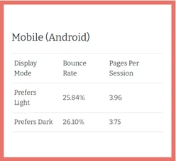
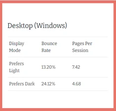
Not every user may find a dark mode to be comfortable or to their preference. Offering a selection of light and dark themes is essential to satisfy various user tastes. Check out the user adoption of Android and Windows, as it represents high acceptance for Dark Mode.


System Integration
When designing for dark mode, developers must take into account how it will interact with users' devices' system-level dark mode settings. This guarantees a smooth and seamless integration of the app with the user experience as a whole.
Case Studies
In order to demonstrate how dark mode design affects user experience, let's examine a few case studies of well-known mobile app development company that have effectively implemented this functionality.

In 2016, Twitter launched dark mode. The feature's eye-catching deep blue background and white writing helped it become widely popular. Particularly in low light, users valued the enhanced reading and less eye strain. The ability to have dark mode activate automatically at night improved the user experience even more.

In 2018, the community-driven website Reddit made dark mode available. The platform's users responded well to the dark look, which had white lettering on a muted background. Because of the ease with which users may transition between modes, Reddit's solution was made available to a large audience.
Slack

In 2019, the popular team communication app Slack included dark mode. The dark theme was well-received for its elegant look and was especially well-liked by businesspeople who used the app late at night or in poorly lit offices. Slack's approach demonstrated a dedication to user convenience and efficiency.
In summary
From being a fashionable option to a necessary component in mobile app development, dark mode design has changed over time. Its allure goes beyond appearances because it solves problems with accessibility, eye strain, and customization. Hire dedicated developers, and they will help you improve the user experience of your apps and keep appealing to a wide range of users by allowing users to switch between light and dark modes. Dark mode will probably be an essential component of mobile app design going forward, helping users have a comfortable and attractive experience regardless of the time of day or the setting in which they use their smartphones.
Frequently Asked Questions
What is the mobile app dark mode, and how does it operate?
Mobile apps with a dark mode feature might have darker backgrounds than typical light-colored ones, frequently with black or dark Gray as the main backdrop color. This design seeks to lessen eye strain, enhance readability, and offer a more comfortable viewing experience in dimly lit areas. It functions by altering the color palette and frequently flipping the custom of having light text on a dark background.
Why is using dark mode thought to be advantageous for users?
Users can enjoy several advantages from dark mode, such as less eye strain, better low-light reading, possible energy savings for OLED devices, and a sleek, contemporary design overall. It also improves accessibility by offering a greater contrast between the background and the text.
Can mobile apps be adjusted for dark mode?
Indeed, a lot of smartphone apps offer dark mode customization choices. Frequently, users can select from a variety of darkness levels, highlight colors, or even program dark mode to turn on automatically depending on the time of day or surrounding lighting.
Is it difficult to create a dark mode in mobile applications?
It can be difficult to implement dark mode, particularly when it comes to making sure that color contrast is correct, preserving brand identity, and testing for usability on various platforms and devices. Additionally, system-level dark mode settings on users' devices and user preferences must be considered by developers.
Is battery life or app performance affected by dark mode?
Because dark mode uses less power while displaying black, it can extend the battery life of devices with OLED or AMOLED screens, although it usually has no effect on app performance. In fact, because there is less glare, several customers claim that their performance in low light levels is improved.
Is dark mode appropriate for all kinds of mobile applications?
Indeed, dark mode is adaptable and suitable for a variety of mobile application types. It is appropriate for anything from social media and productivity applications to reading apps and gaming, and it is not restricted to any particular kind of app.
How can people turn on their mobile devices' dark mode?
The method for turning on dark mode differs based on the operating system and device. Usually, the display or accessibility settings of the device provide access to the dark mode settings. Most gadgets have a button to turn on or off dark mode, and some even have automatic switching based on ambient light or the time of day.


