Mobile App Navigation: Strategies for Intuitive and User-Friendly UI

In today's mobile-first environment, a mobile app's success frequently depends on one key element: navigation. An intuitive navigation system can tell the difference between a user who quickly uninstalls your product out of annoyance and one who excitedly adopts it. More than ever, mobile apps must provide a smooth, user-friendly navigating experience. You must guide your clients through the process and transport them from point A to point B.
Mobile devices have become essential tools in the digital age, and as a leading mobile app development company, we can influence how consumers engage with these devices. This blog is your in-depth resource for comprehending the nuances of mobile app navigation and the tactics that will distinguish your app. We will examine the art and science of creating user interfaces that not only set the standard but also do it in a way that your users find effortless, natural, and second nature.

- The Basics of Mobile App Navigation
- Tips to Design Intuitive App Navigation
- Top 5 UI Components for Mobile Navigation Apps
- Wrapping Up
- Frequently Asked Questions
The Basics of Mobile App Navigation
When consumers download, install, and use your app, they begin their relationship with your brand. Therefore, they ought to have a pleasant, positive experience from start to finish.
According to survey, 25% of consumers stop using an app after their first use. Therefore, it is much more crucial to capture their interest right away.
The navigation and menu design determine the user experience in your mobile app as they travel from one place to another.
Due to the small screen size, ensuring a decent mobile app navigation experience and improving it can be difficult. It is, however, conceivable, and attainable.
It only requires having solid conceptual knowledge, superb design, and a high-performing native app build.
Tips to Design Intuitive App Navigation
Understand Your User's Needs
Research and understand your target market, considering their preferences, routines, and expectations before developing the navigation. User journeys and user personas are useful tools for this approach.
Clear and Consistent Labels
For navigational items, use labels that are precise and clear. Each button or menu choice should have a clear purpose that users can immediately understand. Labeling consistency is also crucial. For instance, do not use "Start" where "Home" has already been used.
Keep it Simple
Simplicity is key. Avoid giving your app too many features and settings. Concentrate on the fundamental features that users will utilize most frequently. Ensure that the most crucial functions are simple to reach.
Visible and Accessible Navigation Elements
Make sure the navigational elements are clear and simple to use. Tab bars at the bottom, hamburger menus at the top, and in-app gestures are common patterns. Put crucial components where consumers will inevitably seek for them.
Prioritize Content
Sort the features and information of your app according to priority. Employ card sorting or tree testing methodologies to learn how consumers anticipate discovering certain materials. You can build a logical hierarchy with this.
User-Centric Design
Maintain a user-centered design. Make sure your navigation responds to the context and actions of the user. For instance, Personalized content suggestions depend on the user's preferences or location.
Regular Updates and Maintenance
The navigation of mobile apps should develop in response to user needs and technology developments. Keep your app's navigation system updated and maintained to remain competitive and current.
Top 5 UI Components for Mobile Navigation Apps
Hamburger Menu

Three horizontal lines frequently represent it as a well-known navigational element. When tapped or swung, it unlocks a side drawer with more navigation options, settings, or features. Accessing less often used features in this organized, space-saving manner keeps the primary interface clutter-free.
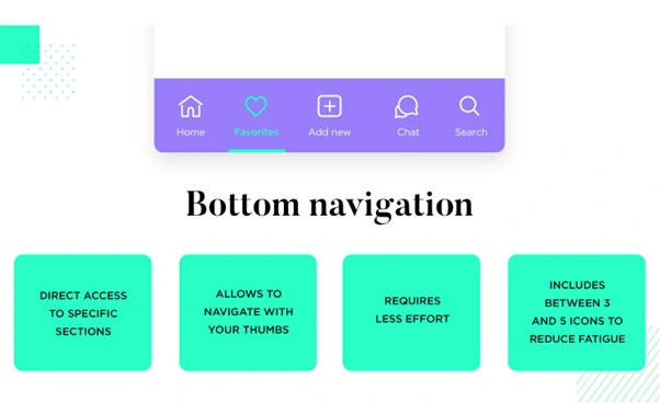
Bottom Navigation Bar

For Android apps, the bottom navigation bar is a design need. It contains text or icon labels at the bottom of the display that links users directly to the most important app areas. Because of its ergonomic design, users can navigate with just one hand, making switching between various perspectives or features simple.
Top Navigation

When navigational components are positioned at the top of the screen, this is called top navigation. This is typical of iOS apps and frequently contains title bars, search bars, and back buttons. It maintains a constant user flow and offers simple access to key features.
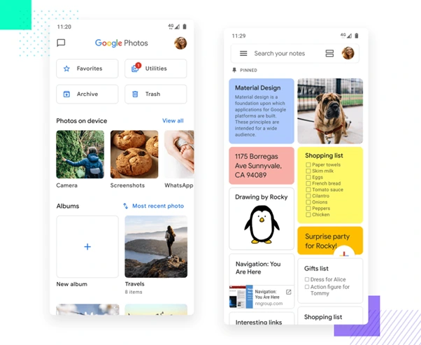
Cards

Cards are user interface elements that convey data or instructions in a distinctly shaped, visually appealing container. They are frequently used as entrance points to portions of an app to display pieces of content. Cards are the best option for visually appealing data organization and presentation because they can include photos, text, and interactive features.
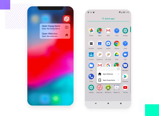
3D Touch

Some iOS devices have a feature called 3D Touch (force touch) that allows users to access more functionality by pushing firmly on the screen. Quick shortcuts or previews are possible without going far within the software. For instance, users can quickly access actions or sneak a peek at content by pressing an app icon without fully opening it.
Wrapping Up
Our exploration of "Mobile App Navigation: Strategies for Intuitive and User-Friendly UI" finishes in the always-changing world of mobile apps, where user experience reigns supreme. Before we go, it is important to emphasize that mobile app navigation is a dynamic, constantly evolving part of app design. The covered methods establish the groundwork for intuitive navigation but should be viewed as a springboard rather than a goal. How we direct people across mobile apps constantly changes according to user feedback, statistics, and the evolving technological landscape.
As a proficient mobile app development company, we have gone into the fundamental ideas, best practices, and crucial UI elements that lay the foundation for an easy-to-navigate and interesting user experience. Looking to elevate your app even further? Hire dedicated developers to bring your vision to life with precision and expertise.
Frequently Asked Questions
Why is mobile app navigation so important?
Navigation in mobile apps is important since it directly affects the user experience. Users are more likely to find and use an app's features when the navigation is intuitive, which increases user satisfaction and retention.
What are some best practices for mobile app navigation?
The use of familiar iconography, consistency in navigation patterns, the prioritization of key content, the availability of search tools, and the provision of buttons with obvious calls to action are all examples of best practices.
What are some emerging trends in mobile app navigation design?
Current trends include micro-interactions, natural language processing for voice requests, augmented reality navigation, and virtual reality immersion.
What are the common challenges in mobile app navigation design?
Finding the right balance between straightforward and feature-rich navigation, guaranteeing consistency, and adjusting to different devices and screen sizes are challenges.
Should I consider implementing gestures for mobile app navigation?
Gestures can improve navigation, but they should be utilized with care and included with instructions or tutorials to make sure users know how to use them properly.


