Responsive vs Adaptive Design: Which One is Better?
Things were really very simple and easy-going before we could get the internet on smartphones and tablets. Having an online presence meant designing a website that would only be seen and displayed on a desktop, and maybe a laptop, computer screen. Now, though, if you are planning to design a website, a plethora of screen sizes and resolutions need to be considered - from a handy device (mobile) to a laptop or tablet screen. And if your web design doesn’t display correctly on any of the devices, a user will quickly move on.
The era we’re living in, where people prefer using mobile devices for visiting websites. However, there is a significant increase in the number of mobile devices. It’s vital for businesses to make their website visibility on smartphones and tablets.
So, have you ever wondered what’s the way to achieve this state of cross-device, cross-browser, cross-platform compatibility? That’s what we’re here for!
There are two hottest methods for implementing multi-screen websites: Responsive Web Design (RWD) and Adaptive Web Design (AWD).
Using WED and AWD, you can optimize the best user experience on a single website when viewed on various devices. Here, as a web design company, we are explaining the difference between responsive and adaptive design.
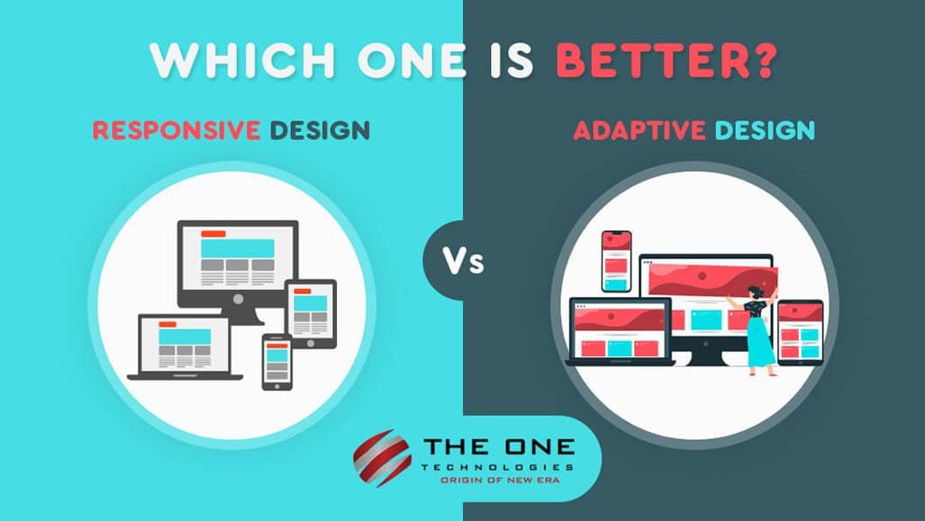
What’s Responsive Web Design?

As you can see in the above graphics, the content on a responsive website “responds” to a user’s varying screen size. When it’s viewed on a smaller screen, such as a mobile device or tablet, images and text adjust accordingly, creating a more streamlined content and appealing look.
Responsive designs work on the basis of flexibility. It will automatically resize the device screen size the website is being viewed on. It has a flexible, fluid grid that uses CSS3 media queries to respond to any screen size.
The web design style uses media queries that allow CSS styles to adapt to different screen sizes. Therefore, whenever a user visits your website on their computer, mobile devices, or tablets, it always encounters a uniform user experience.
The benefit of responsive design is that you only have to create a single version of a web page rather than reformat it for every possible screen size that users may have. This could be accomplished by using special coding with CSS3 media queries. Moreover, it helps in improving your SEO rankings as well.
What is Adaptive Design?

As we can see in the given above graphic, the adaptive design can adjust your web content as per the browser or viewer’s screen size. Instead of repositioning your content on every screen size, designers use a different series of static templates based on different breakpoints in a page’s pixel width on a given device. Hence, whenever a screen reaches a certain pixel width, it automatically adjusts to the next, smaller template until the device width reaches the next breakpoint, and so on.
To make you understand in layman’s terms, the adaptive design creates different fixed layouts that adapt to specific screen sizes. Here are the different screen sizes for devices.
Page content or content layer: HTML
Presentation or layer: CSS and styling
Client-side scripting core or layer: JavaScript

In a more technical way, websites built with adaptive design include the CSS media queries of responsive design, but they also add JavaScript-based enhancements to change the HTML markup of the website based on the device’s compatibility. The whole process is considered as “Progressive Enhancement”.
How do Responsive and Adaptive Design Compare?
For people who are far away from the web design experience, they are not likely to tell the difference between responsive and adaptive design.
Let’s look at their major components to make you understand the easy comparison.
Layout
The layout in responsive design is decided by the user’s browser window.
Whereas, the layout in adaptive design is determined on the back-end, not by the user or browser. The template is being produced by the design of every device class. The server fetches the factors like device type and operating system to notify the correct layout.
Load Time

No user can wait for more than 3 seconds on your website to open. They get impatient and bounce if it takes more than 3 seconds. When we talk about adaptive design, it loads faster than responsive ones. Just because in adaptive design, it only transfers necessary assets specific to each device. For example, if you are viewing an adaptive website on a high-quality display, the images will adjust to load faster based on the user’s display.
But this is not always the case. The One Technologies developed a feature for responsive design that pushes all inline images - both dynamic and static to automatically scale to fit every device size and resolution.
Flexibility
Even if there’s a new device or screen size that comes in the market, responsive designs are flexible enough to work well on their own by default. In the long run, responsive design will require less maintenance.
On the other hand, adaptive design is considered as less flexible. It’s because whenever there’s a new device or screen size available in the market, the adaptive design cannot adjust its size. That means you will have to edit an old layout or add a new one to make it compatible with the new size. Therefore, adaptive websites will need occasional maintenance.
SEO Friendliness
As per the Google guidelines, responsive websites are more SEO-friendly. Hence, a mobile-friendly website ranks higher on the search engines results page than any other website. Henceforth, it would be tough to survive in SEO for adaptive websites.
Advantages of Responsive Design
Let's look at the pros and cons of choosing a responsive web design.
Seamless Experience
Regardless of the device size and its type, users can get a seamless and hassle-free experience.
Fewer Maintenance Tasks
Since the website uses the same content across different devices, it will not require much engineering and maintenance time. A responsive design will let you put less effort and thus time updating the website. Moreover, you will get more time for essential tasks like testing, marketing, customer services, and content development.
More Budget-friendly
Since you don’t need to adjust the screen size of your website, it’s easier to set up and implement. You can save your time and effort for development, maintenance, and cost associated with creating stand-alone mobile sites.
Improve Crawling and Indexing Efficiency
A single web crawler agent will crawl your whole responsive website page once, rather than crawling multiple times with different crawler agents to retrieve all versions of the content. This way, the responsive site improves the crawling efficiency and indirectly helps search engines index more of your site’s content.
Search Engine Friendly
As we know, Google favors mobile-friendly or responsive websites. So, whenever you develop a website, make sure your web design tool allows you to create responsive websites that are accessible across all devices.

Disadvantages of Responsive Design
Every coin has two sides. Responsive web design comes up with few drawbacks as well. Here are the things you should consider too while choosing this responsive design.
Slower Page Loading
Page loading time is one of the major concerns we face while using responsive web designs. Because it increases the page load time as all elements are downloaded, whether used or not.
Difficulty Integrating Advertisements
Since the advertisements have to accommodate all resolutions, it can be harder to integrate them with responsive designs. The website will flow from device to device, so while the site adjusts as per the relevant screen size, ads may not be proper to display.
Let's look at the pros and cons of choosing an adaptive web design.
Advantages of Adaptive Design
Targeted for Each Device
By optimizing the web design for every individual device, you ensure to reach every visitor that comes across your website and receives a positive user experience. You can set and manage the content as per the user’s location and connection speed.
Faster Loading Time
Only the version of the website users need will be loaded, which loads a page little faster. This is especially applicable for smartphone users.
Optimized for Advertising
With adaptive websites, based on the user’s data from smaller screen sizes, designers can optimize advertisements.
Reusable Existing Website
This means you don’t need to re-write code again from your existing website from the ground up. Because many complex websites are built with a legacy over time and it’s not easy to write everything from scratch.
Disadvantages of Adaptive Design
Hard to Create
Adaptive design is not easy to develop because there are many technical aspects to consider.
Not Easy to Maintain
Since you have multiple versions of the website, you have to update each version separately. For adaptive design, you need to have at least six common screen widths: 320, 480, 760, 960, 1200, and 1600 pixels. And these numbers keep adding and growing, making a tough job for designers. This is the reason it consumes too much time to maintain the website.
Expensive
Apart from consuming too much time to develop and maintain the website, adaptive web design requires a plethora of developers. That will add-on more expenses to handle the complexity of the development and maintenance of the adaptive website.
When to Use Responsive Design?
If you still have got no idea, here are the final considerations when you can choose the responsive design.
- It’s completely suitable for small to medium-level companies that need to update their existing websites.
- It’s an ideal choice for new businesses that need to build a brand-new website.
- It’s recommended for service-based companies because their primary focus is text and images.
- Responsive design is budget-friendly so you can have an amazing and beautiful website at a reasonable cost.
When to Use Adaptive Design?
Here are the final points to keep in mind considering adaptive design.
- It’s suitable for existing complex websites that require a mobile version.
- It’s highly recommended for speed-dependable websites.
- It’s great for a highly targeted experience you can adapt to someone’s location, connection, speed, and more.
- It’s suitable for those who need control over how their site is delivered to different users across different devices.
Conclusion
Every day many devices are launched in the market, people around the world are quick to adapt. This makes it very complex to choose between responsive and adaptive design.
If you are running out of budget and want a cost-effective solution and a more convenient way to build high functionality features, responsive web design is the option, you should choose. Moreover, in the long run, responsive websites require less maintenance too. But this is merely a generalization. On the other hand, the adaptive design also comes with several benefits compared to responsive design like a more personalized and target user experience.
Now the key is all yours, which one you would like to go for.
Otherwise, leave everything aside and become a stress-less by partnering with a versatile website design company, The One Technologies. Understanding your requirements and future-scope, our web designer company will provide you the compatible and appropriate solutions for your project. Hire a website designer from us to leverage the benefits of web design services.