Top UI/UX Design Trends for 2026

Along with time and new technologies, web design trends are constantly evolving. When we are halfway through this 2020 year, we have seen many web design trends have taken over the applications and users have adopted it happily. However, there are many trends we might expect to see in the rest of the months.
Many business owners or people generally take things lightly when it comes to considering the website design. They are now aware of the impact and importance of web design. Since your website itself represents your identity - products and services, it may help you generate revenue and convert the customers into visitors too.
If you are looking forward to generating quality sales for your products or services and want to stay ahead of the competition, then it’s highly recommended to adapt the web design trends which have set the floor on fire.
In order to stay in the race and not lose users, your web apps themes should be updated from time to time. We know, there are endless possibilities with new techniques. At the same time, there are some popular styles that will not vanish, such as the ever-present minimalism and colorful flat illustrations we have been seeing for some time now.
So, what are the trends that are already ruling and will rule in 2020? We have gone through deep research over the internet and asked some of the expert designers. As a prominent web and graphic design company, we have curated some of the latest and important trends of web design that will rule in 2026.
UI/UX Design Trends in 2026
Let’s walk through some of the leading UI/UX design trends of 2026 in detail.
1. Dark Mode
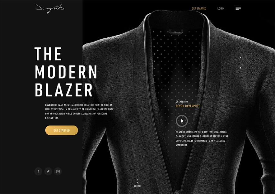
‘Dark Mode’ is one of the hottest web design trends for 2020. Many applications are opting for dark mode in their applications. There are many big brands like Twitter, YouTube, WhatsApp, Gmail, Instagram, Apple, and Android offer alternative themes in their products. Definitely, you will be no surprise if you see websites adopting the theme.

The dark theme makes the brand image or the product quite royal and formal. The dark mode makes in the top list that - it doesn’t give a strain to users’ eyes and lets them ready typography to ensure that the design is readable. It soothes the eyes, no matter how bright the screen is. Since users love this dark mode, chances are high that the users will switch on it immediately.
Let’ find out why dark mode is so popular:
- It looks ultra-modern
- It highlights the other design elements
- Lets you save device battery power (in case of OLED/AMOLED Screens)
- Reduces eye strain in low-light conditions
2. Minimalism
Minimalism or White Space is the best way to represent your website in recent times. It’s a term referring to the blank areas in between design elements.
If your website is loaded with lots of content and images, along with users, Google will not care to adapt it. It can slow down a browser due to its overcrowding. So, to have a balance, minimalism can be taken into consideration. It’s based on large swaths of white space.
Whitespace design in websites will give different elements to breathe, easier to navigate along with enhancing user experience. It gives any page or screen a spacious, well-balanced feel. Luxury brands implement the minimalist design for their websites.
Our experts recommend having too many colors on the website while giving fewer elements to let each page breathe through empty spaces. Whitespace includes the spacing between lines or columns of text, the space around each of the visuals, or the margins around the page.
3. Immersive 3D Elements
3D design elements have fascinated users for many years. Since AR and VR have covered the area in technology, this trend is going to increase this year. So, it’s a great mixture of these techniques to create hyper-realistic 3D visuals taking up the whole users’ screen.
This allows UI/UX designers to make their website wonderful and amazing. This way, customers can stay on your website for a long time and increase the average session time. Such visuals grab users’ attention as they transcend boundaries between the virtual space and real life.
3D graphics implementation gives the high performance of your website UI. It’s a trend we started to see a lot near the end of the decade, and expect to see a lot more of in 2020.
4. Custom Illustrations
The illustration makes your website alive with showcasing your brand in a creative manner. The modern web design takes inspiration from print publishing and other traditional art formats to develop illustrations for the websites.
Websites harness different visual tools in telling a compelling story. The right placement of illustration can make a big difference on your website.
To make your website more appealing and encapsulate your brand’s vision, invest time in going through high-quality media features to find images that are perfectly tailored to your brand’s specific needs. Digital illustrations will surely make your brand stand out in an excellent way. It’s the perfect way to represent your brand. Many companies introduced illustrations in their visual language.
5. Animation
Almost every website you dive in is loaded with animation. What everyone is adopting now is liquid-style animation with movement that seems water-like. Liquid animation can work for entire scenes as a way to transition video elements. It uses liquid animation as a hover state to bring an extra motion to elements on the screen.
The trick to making this trend work is in the speed of movement. It has to be smooth, fluid, and perfectly timed for the most realistic feel. Generally, animations are independent of any action we may take on the page as site visitors.
Many websites will incorporate this animation into their website. However, clicking, hovering, and other visitors’ actions can bring about alterations of color, size, design, etc. The animations play a vital role when you want your website to be more captivating and stimulating, yet keep its simplicity and elegance.
6. Typography
There are many experiments that developers are doing with web design trends. Like, this year, designers are breaking the traditional typo patterns with the latest, unique, and bold typography to get started with.
The typography can be made of odd spacing, line spacing or break between them, ill sizing and, more. The user will be able to understand the meaning behind the unique integration of typography. Somehow, it will work as an art. But on the other side, you have to ensure that you are not breaking the concept of readability.
Bold typography and oversized lettering are gaining more and more popularity, as website owners strive to simplify web design as much as possible.
Conclusion
2026 will create a new wave in web design companies - a mixture of old-fashioned bold fonts, 3D elements, animation, dark UI, voice user interface, and whatnot! To succeed in developing a unique and engaging user interface, try to adopt several trends for your website.
As an experienced web and graphic design company, at The One Technologies, we firmly believe that the main goal of UI/UX design is to grab users’ eye and generate revenue. For this reason, don’t try to overdose your website with many web design trends that may make your website cluttered and overcrowded.
If you are looking to hire graphic designer, then expert UI/UX designers at The One Technologies can help you implement all your requirements.


