What Is Responsive Website Design?
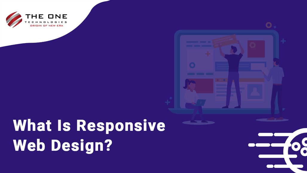
You might have heard of the new trend of Responsive Web Design (RWD). It is a web design approach aimed at designing the website suitable to work on every device and every screen size. Responsive web design is focused around providing an intuitive and gratifying experience by easy reading and navigation with a minimum of resizing, panning, and scrolling—across a wide range of devices.
Responsive design plays an important role in web design right now. Responsive design can help you solve plenty of problems the way it looks on devices with both large and small screens, and increase the amount of time that visitors spend on your website. It can also help you improve your search engine ranking.
Since the people have switched to mobile devices, it’s necessary to have your web design that works seamlessly on every screen irrespective of its resolution and device type. Responsive design makes your website mobile-friendly and improves the way it looks on devices with both large and small screens. It also lets your users visit your website frequently, thus, increasing your website traffic. It can also help you improve your rankings in search engines.
With responsive design, your web pages are capable of adapting the user’s devices’ resolution and give the best experience, whether they’re using desktop, laptop, mobile, or tablets.
What’s a Responsive Website?
A responsive website changes the layout to offer an experience based on the device being used, especially ideal for mobile viewing.
A mobile responsive website consists of:
- Proper and readable text without requiring zoom
- Adequate space for tap targets
- No horizontal scrolling
Device Friendly Website
2020 is a year of gadgets, smartphones, and tablets. According to the study, Tablet sales are expected to exceed 100 million this year. It makes clear that 60% to 70% of visitors to your site might be using smartphones or tablets and this percentage is ever-growing. This is where the device friendly responsive website design comes to rescue. Whether it is a small screen of mobile, tablet or larger screen of desktop, the website will look consistent across all screen sizes.
Technically, the responsive web design uses "media queries" to figure out what resolution of the device is being served on flexible images and fluid grids then size correctly to fit the screen.
Let’s take a look at an example of a Restaurant website below when you shrink your browser, the content resizes to fit. Here is how the same website looks like in different screen resolutions and devices:
Responsive Website Look on Desktop Screen
Notice the left sidebar and large banner image.

Responsive Website Look on Tablet Screen
Notice the left side menu has been adjusted at the top. The banner image has been shrunk to fit the tablet screen.

Responsive Website Look on Mobile Phone Screen
Notice the top menu icons are hidden, the logo has been adjusted in the middle and the banner image has been shrunk to fit in the mobile screen!

Why Mobile Friendly Websites Rank Better in Search Engines?
Nowadays, many companies are adopting the Search Engine Optimization (SEO) for better results of their websites. It helps their website to boost the ranking of search engines. The closer you are to the top, the better the chance potential customers you will get.
Responsive design is the add-on factor to SEO because Google gives preference to websites that are mobile-friendly. As compared to other SEO factors, responsiveness can help give you a big boost in search engine results.
Google cares about mobile-friendly websites. It’s very important for organic search results if your website is mobile-friendly. If your website falls into the “unfriendly” category by Google, expect a possible penalty. This penalty can cause your website to suffer from a lower search ranking on Google. The search engine friendly mobile websites are important because the lower your business ranks, the less likely mobile users will see your business first on a given page. This will eventually impact your website traffic and overall online presence.
Conclusion
People use their mobile devices to leverage various on-demand services or surf the internet. It’s your responsibility to give them everything they're looking for with the perfect and seamless user experience. To ensure you have the best chance of reaching a wide audience, your mobile website must be search engine friendly and your web pages load fast. You can also compress your code, eliminate flash, and reduce the file size of your images.
If you are looking to develop a responsive web design for your website and want to search them on the top pages of search engines, then The One Technologies is the right choice for you. As a web development company, we help our customers to create device-friendly websites with responsive web design. Our web designers are very well versed with the latest technologies and trends and help you develop a responsive SEO-friendly website.
We offer web development and web design services to our clients. We have launched 1000+ websites from inception. If you are looking for an expert and talented web designer to design device-friendly websites, contact us to Hire a Web Designer.